Helping people in crisis navigate shelter, food, and legal aid
Summary
Opendoor is a mobile app that helps people in crisis find verified shelter, meals, and emergency support in minutes, replacing fragmented paperwork with clear, plain-language guidance.
My Contribution
As co-founder and design lead, I led 50+ usability sessions with shelter residents and prototyped the core service discovery flows from 0 to 1 using Figma.
Timeline
From May 2025 to Aug 2025
Team
1 Product Manager
2 Designers
2 Engineers
Skills
User Research
Interaction Design
Rapid Prototyping
Usability Testing
Tools
Miro
Figma
UserTesting
Outdated, fragmented systems prevent people in crisis from finding immediate help.
Even after finding the right service page, users had to scroll through 4 screens before reaching eligibility requirements, one of the first things people need to know before calling or visiting. That audit became the foundation for Opendoor, rebuilt as a mobile-first experience designed around clear information hierarchy from the ground up.

Fragmented information turned simple searches into exhausting dead ends.
Through 13 shelter staff interviews and surveys across 50+ community members, three critical pain points emerged. Without real-time updates, people spent limited time and transit money traveling to locations that couldn't take them.
Key Insights
48%
took wasted trips due to unclear eligibility
20+ minutes
spent hunting per single resource
4+ sites
checked just to find a single service

Competitive Analysis
Current tools force people to choose between complex emergency directories and generic consumer maps.
The patterns from our Good Samaritan research pointed to a gap larger than one shelter's website. Existing directories like 211 and FindHelp aggregate resources but are hard to navigate, while general tools like Google Maps and Yelp are easy to use but aren't built for the specific, often urgent needs of vulnerable populations.

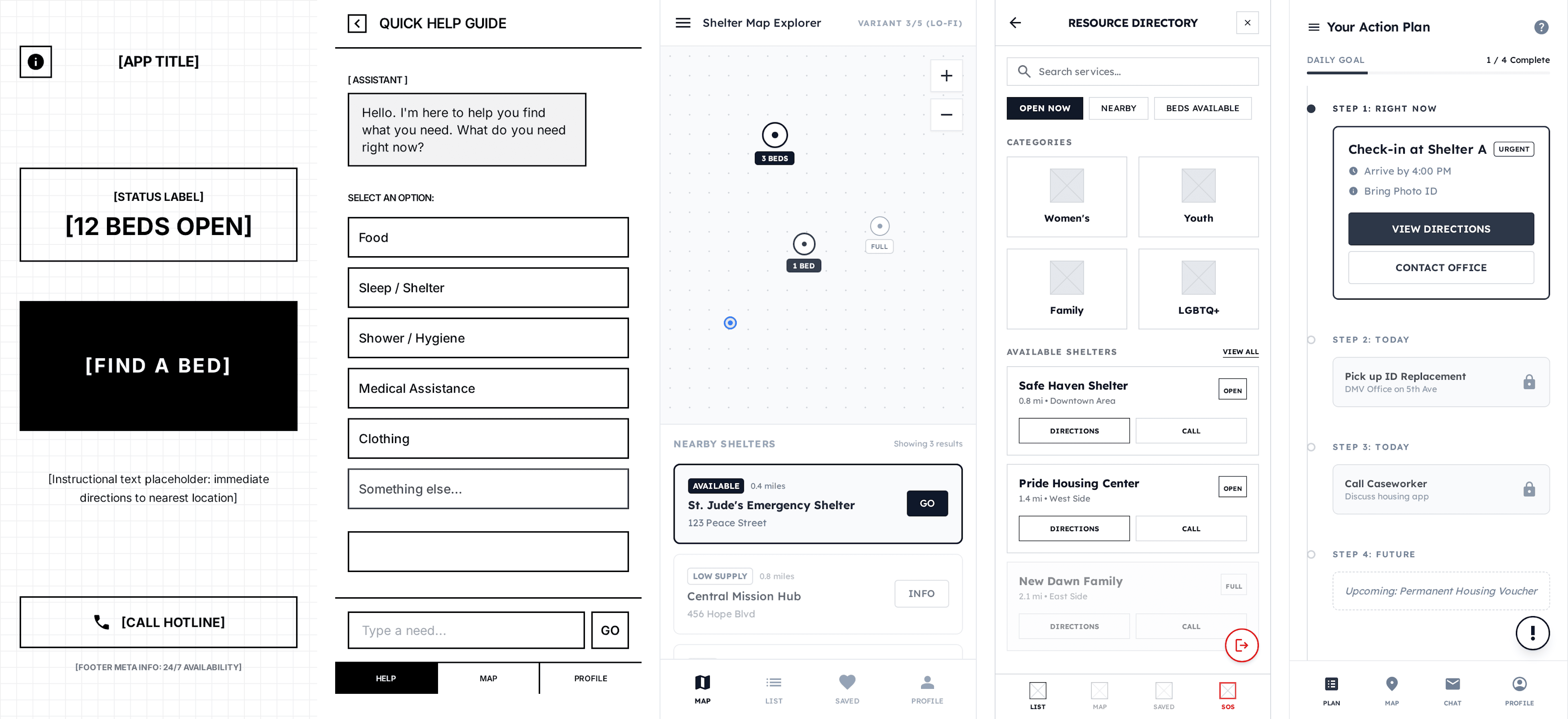
Rapid AI prototyping helped us evaluate different layouts in hours instead of days.
We tested four early layouts, from a simple search bar to a map view, to see what was easiest for people to envision themselves using before fully flushing out the final designs.
We defined the core MVP user flow by identifying what to prioritize and intentionally cut.
Before designing any screens, we mapped every possible user action and narrowed the core experience down to three core MVP flows: the homepage, service details, and conversational AI search, with supporting features like offline access, bookmarks, and accessibility settings built around them.


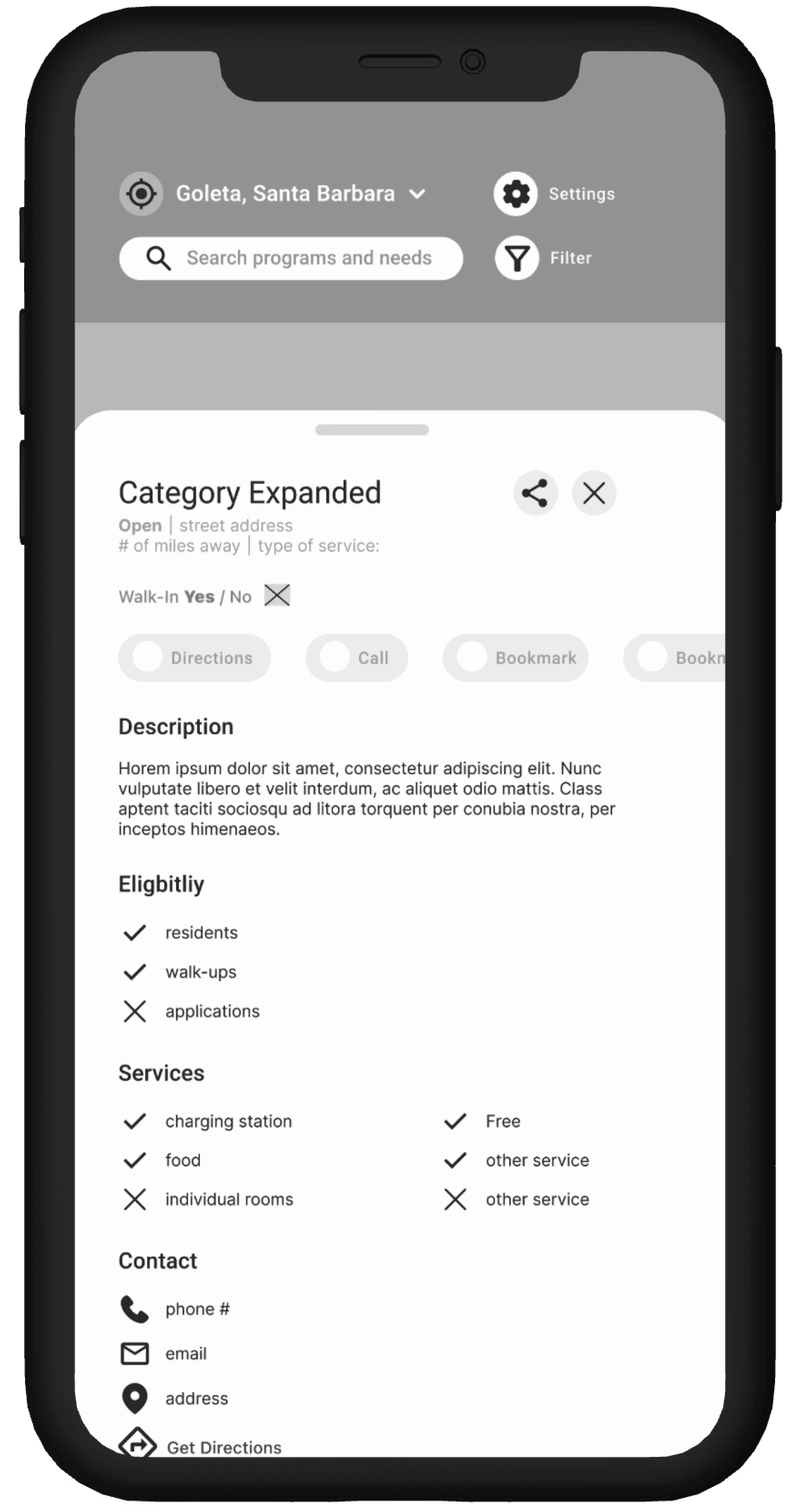


Validated with 50+ users and 5+ shelters including a responsive design system in 8 weeks.
Key Outcomes
$10K Winner
Kevin Xu Innovation Challenge
Harvard & AWS
incubator & sponsor backed
92% user intent
would use if deployed locally
