Berkeleytime

Bridging Design and Engineering
Summary
Years of rapid feature releases without a standardized design system led to fragmented UI, duplicated work, and friction between design and engineering, so our team built Berkeleytime's first design system from the ground up.
My Contribution
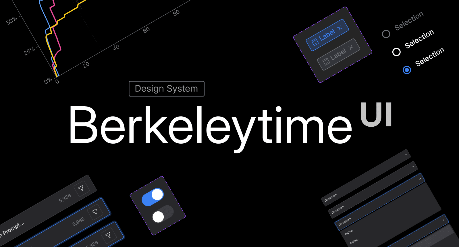
I built our foundational design system in Figma with a team of 2 designers, then, as design lead this semester, translated it into a token-based system connecting Figma to code via Storybook. We shipped a 48+ component, WCAG-AA compliant library.
Timeline
From January 2025 to Present
Team
1 Engineering Lead
1 Design Lead
1 Engineers
2 Designers
Tools
VS Code
Figma
Storybook
Claude Code
Skills
User Research
Prototyping
Usability Testing
Frontend

Overview

A scalable design-to-dev workflow built to reduce friction and ensure UI consistency.

A 204-person survey revealed recurring issues with broken breadth filters, glitching grade distributions, and missing class sections. Users said these bugs reduced trust in the platform, weakening the reliability that made Berkeleytime preferable to CalCentral, (UC Berkeley's official course enrollment system).
Key Highlights

48+

Components built on Radix UI, establishing a 1:1 token structure between Figma and React

1157+

hardcoded values… to none across padding, gap, border-radius, and shadow
Before: A Grades page built with hardcoded CSS
Inconsistent component rendering, a broken A+ bar, mismatched card styles, and an oversized tooltip, all symptoms of miscommunication between engineers and designers working without a single SOT.
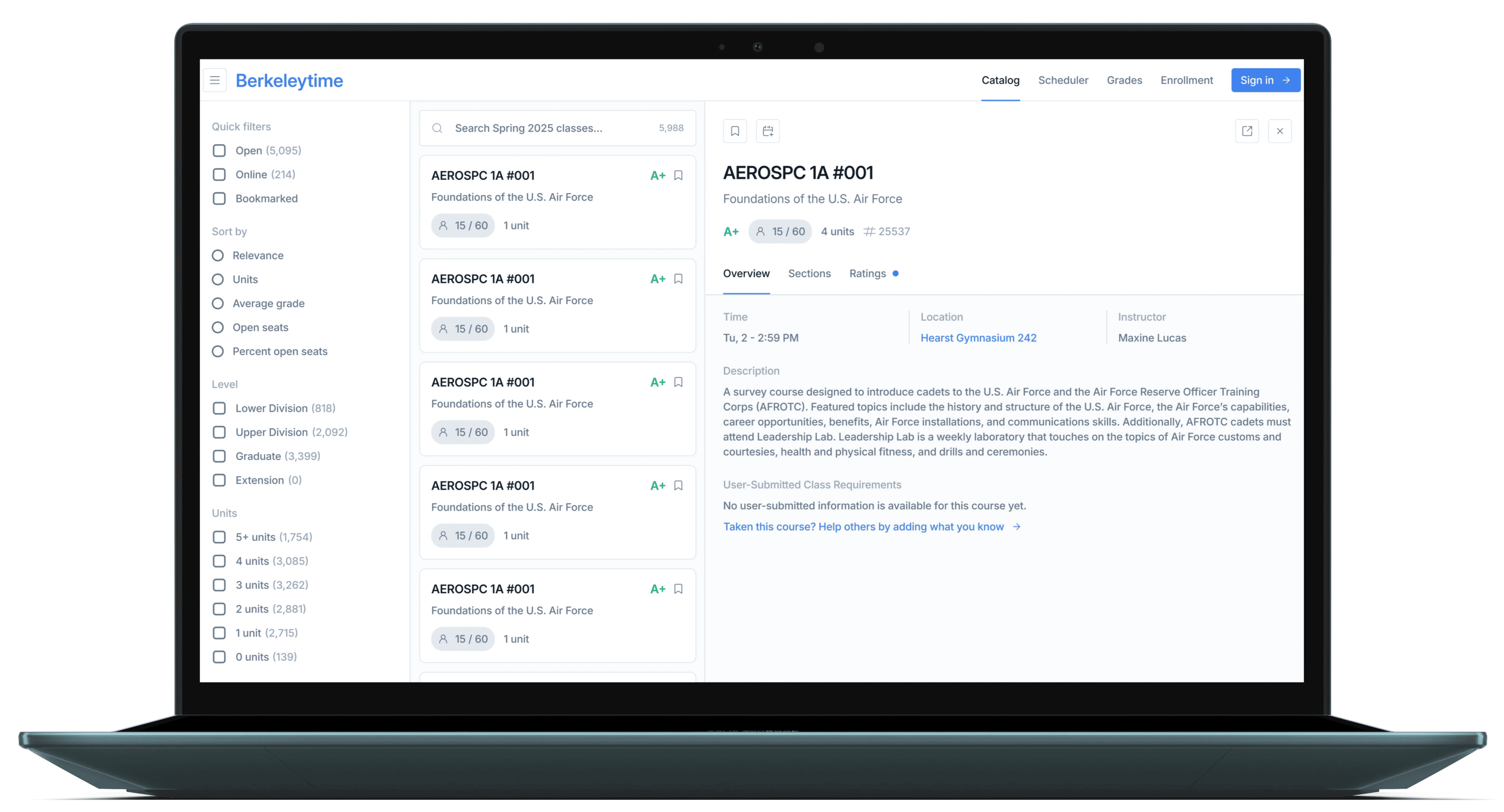
After: Standardized Grades & Analytics interface
Unified data visualization components, consistent card hierarchy, and a cohesive interaction language across different states (active and inactive), shipped using our component library and actively being built in Storybook.

The Problem

Structural Code Drift & Fractured User Trust

For 50,000+ monthly users, finding and filtering Berkeley courses should feel fast and frictionless, not like piecing together information scattered across inconsistent UI patterns. For 50,000+ monthly users, finding and filtering Berkeley courses should feel fast and frictionless.
Figma Copy-Paste Drift
Without shared production tokens, the Course Card was implemented differently across pages, resulting in variations in typography, color, and spacing.
Designers used static values in Figma like #003262 and 17.5px with no linked tokens

Without root variables defined in production, devs use raw generated fallback values.

Developers inspect pixels line by line and hand-coded CSS, duplicating work each time.

Handoff reviews bloated into multi-week iteration cycles fixing visual drift and accessibility bugs.
Manual & High-Friction Handoffs
With no copyable component primitives in Storybook, developers were forced to rebuild components from scratch, turning handoff reviews into multi-week iteration cycles.
User Research

A pattern of inconsistent feature updates had fractured user trust over time.

A 204-person survey revealed recurring issues with broken breadth filters, glitching grade distributions, and missing class sections. Users said these bugs reduced trust in the platform, weakening the reliability that made Berkeleytime preferable to CalCentral, (UC Berkeley's official course enrollment system).

Deep Dive

We audited existing UI to identify the highest-impact, most inconsistent components first.

For 50,000+ monthly users, finding and filtering Berkeley courses should feel fast and frictionless, not like piecing together information scattered across inconsistent UI patterns.

Solution

Component library highlights

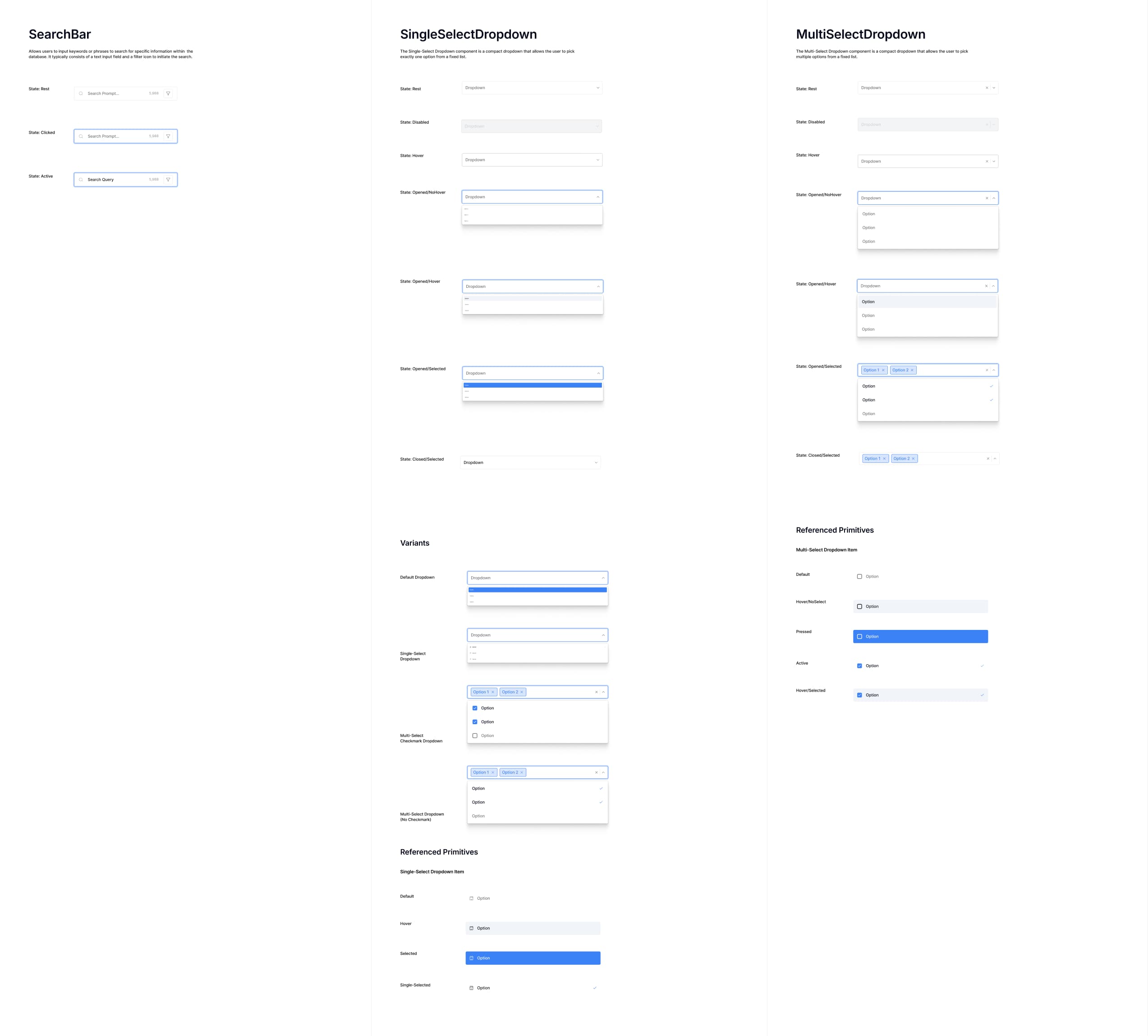
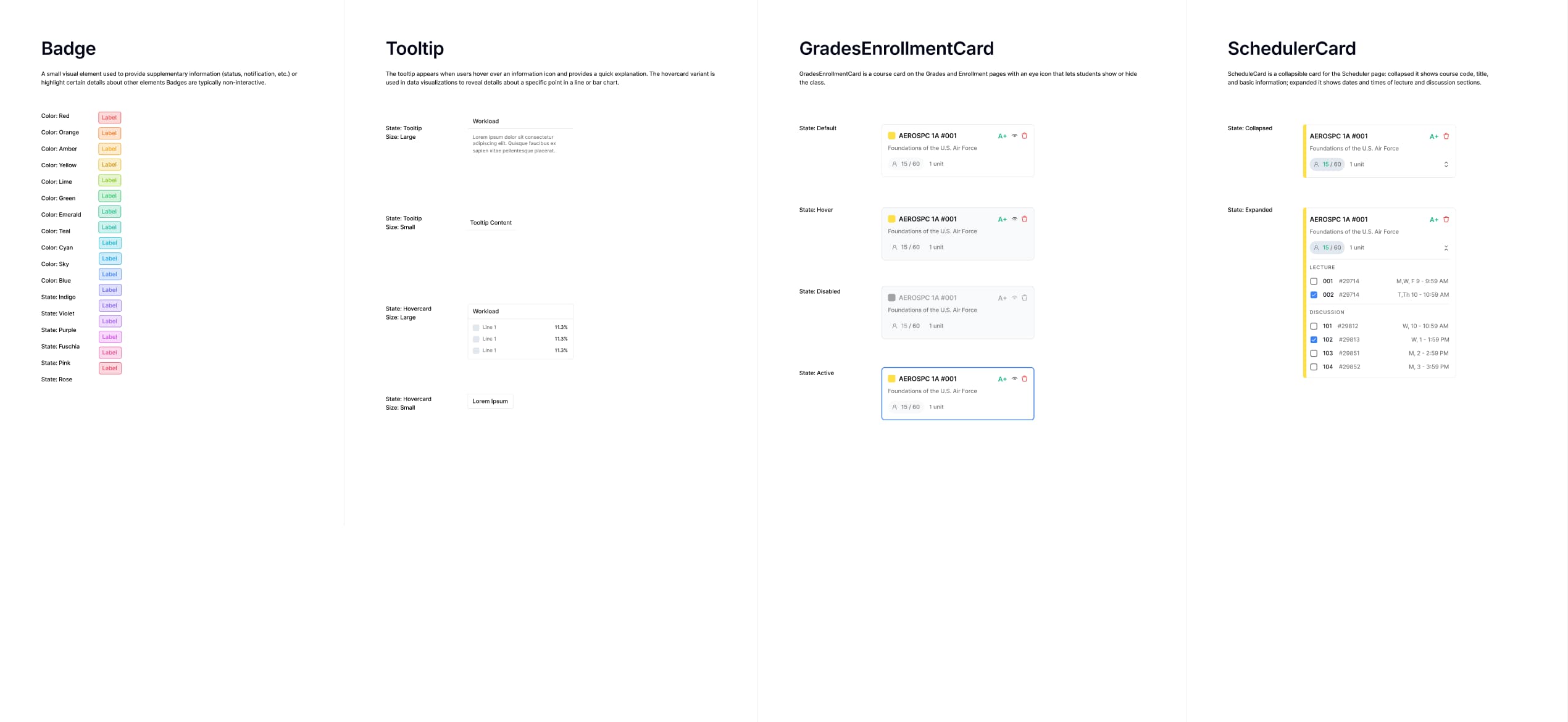
35+ WCAG-AA accessible components across 8 categories, foundations, inputs, call to action, communication, data visualization, lists, containers, and navigation, each documented across interaction states and implemented in Storybook as a live reference for engineering.
Key Highlights

100%

Of the engineering team references component library before pushing prod

100%

Of the engineering team references component library before pushing prod

2 rounds

Design-to-dev handoff reduced from multiple review cycles to two

Key Design Decisions

The system in practice, how components translated into a more consistent UI.

For 50,000+ monthly users, finding and filtering Berkeley courses should feel fast and frictionless, not like piecing together information scattered across inconsistent UI patterns.

Before

Course cards used mixed type weights, colors, and badge styles with no shared language
Filter panel lacked hierarchy
No inline way to preview sections or ratings

After

Consistent card components with unified enrollment, grade, and unit display
Structured filter panel with clear groupings, dropdowns, and a range slider
Inline detail panel lets users preview course info, sections, and ratings

Before

Bar colors have no legend or labeling system
No way to identify which course or instructor a data set belongs to

After

Added courses display as color-coded cards with instructor and semester context
Chart bars map directly to each course via consistent color tokens

Before

Multiple enrollment curves with no course labels or color legend
No way to distinguish which line belongs to which course or section
No way to see service status, distance, or availability at a glance

After

Single course view with clear enrollment milestones and waitlist data surfaced
Missing data states handled explicitly with inline tooltip explanation
Course card anchors the chart, instructor, semester, and section all visible at a glance

Outcome

From fragmented UI to a comprehensive system applied across every new feature shipped.

The design system became the foundation for all new Berkeleytime development. Engineers referenced Storybook components directly, reducing the copy-paste drift that had accumulated across the codebase. The grades and enrollment pages, Berkeleytime's two highest-traffic views, were rebuilt using the library, restoring the visual consistency that 50,000+ students depend on each semester.
Key Highlights

48+

components are a part of our library

20+

comments appreciating updated UI through usability testing

Reflection

Design systems work taught me the importance of balancing communication with craft.

This project taught me that design quality at scale isn't about individual screens, it's about the infrastructure that makes consistency possible in the first place. Building a shared language between design and engineering required as much communication and prioritization as it did craft, and the impact showed up not just in how the product looked, but in how the team shipped.

Back

Overview

The Problem

User Insights

Designing the Solution

Impact & Outcome

Reflection