Home / Berkeleytime
Over years of rapid feature releases, unstandardized UI patterns and inconsistent designer-to-dev handoffs led to a fragmented user experience, duplicated work, and growing friction between design and engineering. To address these challenges, our team set out to build our first design system and bridge the handoff workflow from the ground up.


Team
2 Engineer
3 Designers
1 Design Lead
Skills
User Research
Frontend
Design Systems
Tools
Figma
Storybook
VS Code
Claude Code
My Contribution
Built our foundational design system in Figma with a team, then, as the lead designer this year, translating it into a token-based system connecting Figma to code via Storybook.
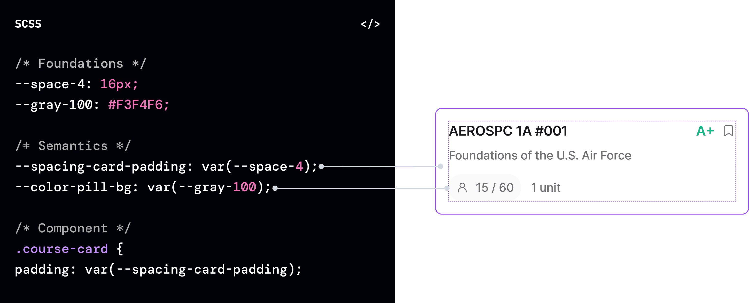
From Hardcoded Styles to a Scalable Token System
We applied our token architecture to Berkeleytime’s most heavily-visited Grades Distribution page, replacing hardcoded charts with token-backed Radix components for a more consistent, accessible, and responsive experience.

Before: A Grades page built with hardcoded CSS, inconsistent spacing, and non-WCAG-compliant color contrast.
Inconsistent component rendering, a broken A+ bar, mismatched card styles, and an oversized tooltip, all symptoms of miscommunication between engineers and designers working without a single SOT.
After: Standardized Grades & Analytics interface powered by 48+ Radix-mapped tokens, crisp chart semantics, and built-in theme support.
Unified data visualization components, consistent card hierarchy, and a cohesive interaction language across different states (active and inactive), shipped using our component library and actively being built in Storybook.
Without a single source of truth for design tokens and components, developer productivity slowed and UI consistency declined.
The User Experience: Fragmented UI Patterns
Students encountered mismatched component variants (like the 3 course cards shown below) across different pages, degrading trust on Berkeleytime’s primary course discovery tool.


Our core user on average had to spend 20+ min searching 4+ sites to find a single relevant service.
48%
Reported a wasted trip due to missing or unclear eligibility information
87%
Rely solely on mobile devices for internet access through the help of the lifeline program

"Many links look broken or are outdated. Who do I even trust? Let me just Google something, anything that can help." — Anonymized interviewee
Users struggle to navigate fragmented support resources, outdated information, and identify a clear path to help.

TLDR; Mapping the user journey revealed a key insight: the lowest emotional point isn’t the crisis itself, but the search for help. Users arrive with urgency and often leave more overwhelmed due to fragmented resources and unclear next steps.
Current solutions fail to serve vulnerable populations with local, contextual needs.
Existing tools like 2-1-1 or FindHelp either cater to generic audiences or suffer from complex, non-mobile-friendly navigation. OpenDoor fills the gap as an easy-to-use, localized platform tailored specifically for individuals in crisis.

Our Bet: Leveraging conversational AI to reduce staff burden and personalize support.
To maximize impact with limited resources, we categorized potential features into a impact/effort matrix. We prioritized AI search and offline access as critical "Big Bets," while cutting low-value friction like forced account creation.

Our Goal
Transform fragmented shelter data into an AI-assisted mobile experience that cuts search time to under 5 minutes with upfront eligibility and clear next steps.
Defining a minimal and clean visual identity.
OpenDoor's visual identity centers on trust and ease. Warm tones, high-contrast type, and WCAG-AA accessible color pairings ensure the app feels approachable for users navigating stressful situations rather than sterile or overwhelming.


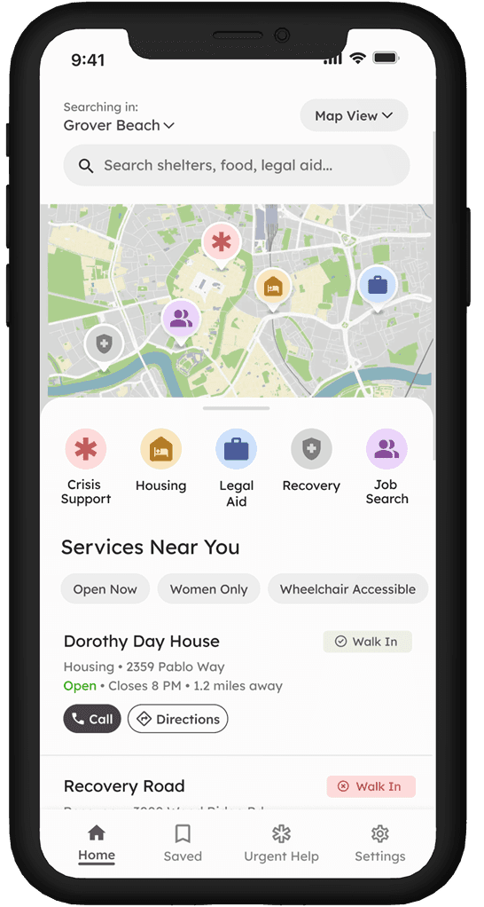


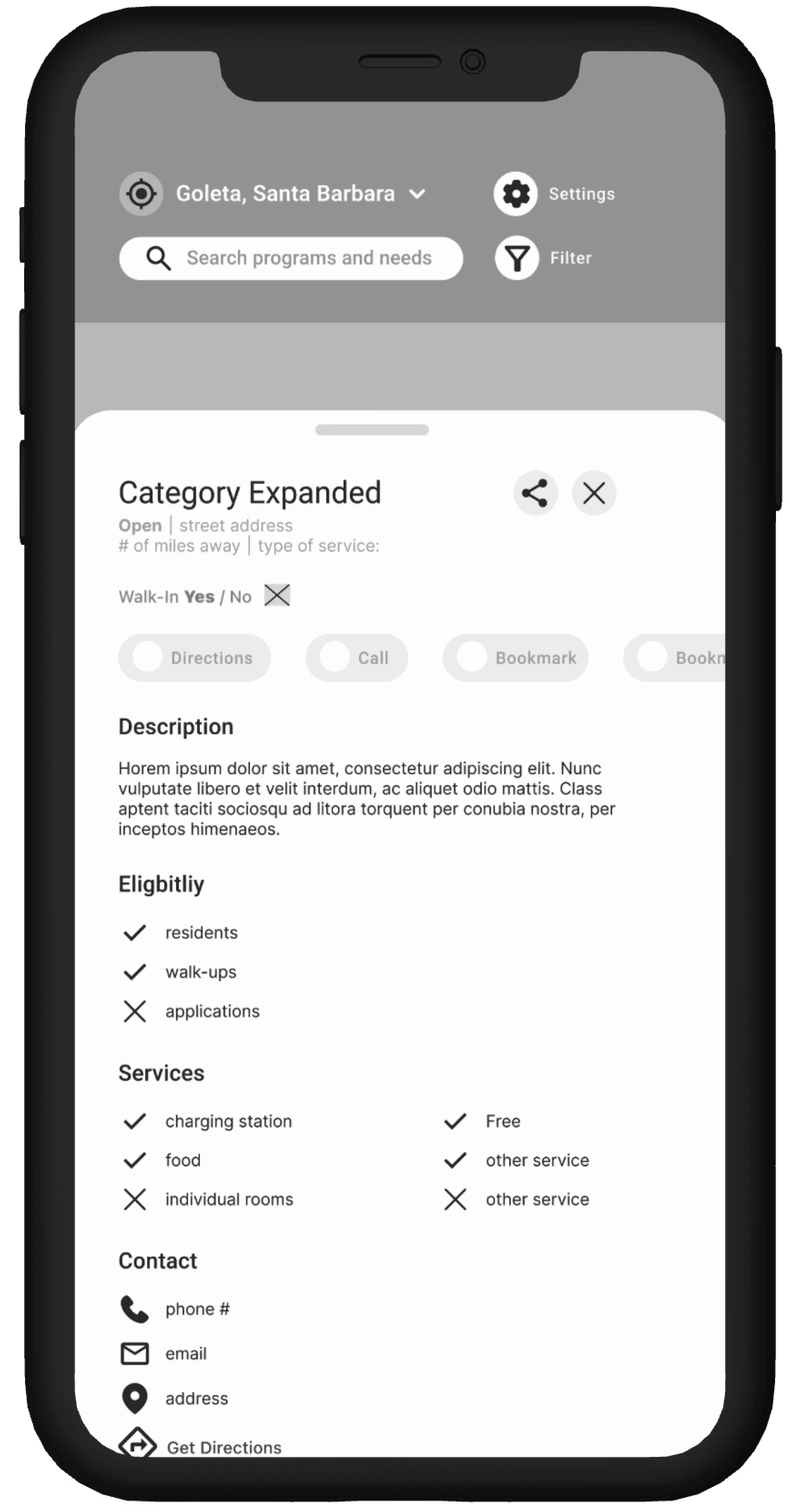


Over the course of 8 weeks, we designed 10+ screens, 26+ components, built for Android and iOS.
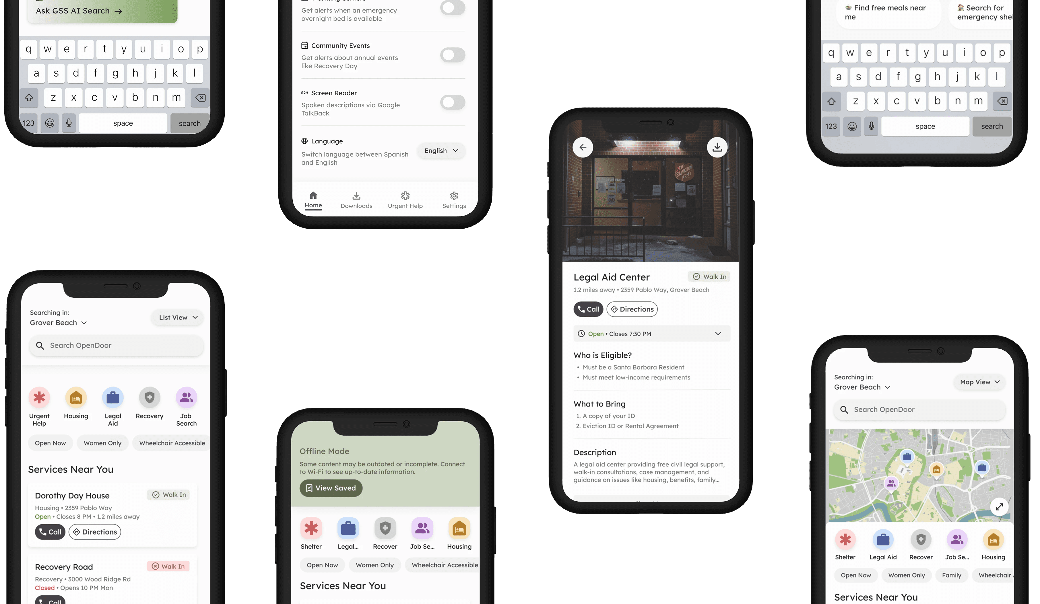
From problem ambiguity to decisive product bets and shipped experiences.
Early on, I focused heavily on information architecture. But talking with caseworkers made me realize users needed upfront visual proof, like entrance photos and live bed availability, to feel safe approaching a shelter. Trust is an accessibility requirement.
Explore More Work