HOME / OPENDOOR

Founding OpenDoor, a Shelter & Housing App

Founding OpenDoor, a Shelter & Housing App

A mobile platform connecting 5000+ residents to shelter, housing, and social services. Built across 10 screens and 26+ components for Android and iOS, with full-scale deployment planned across Santa Barbara County.

TEAM

1 PRODUCT MANAGER

2 ENGINEERS

2 DESIGNERS

TIMELINE

MAY 2025 — DEC 2025

TOOLS

FIGMA
FRAMER
USERTESTING

SKILLS

USER RESEARCH
INTERACTION DESIGN
PROTOTYPING
USER TESTING

PROBLEM

How might we unify Santa Barbara's fragmented social services?

Good Samaritan Shelter serves 350+ social services across Santa Barbara County, but vulnerable residents had no unified way to find them. Scattered sites, broken links, and mobile-unfriendly pages left people without a clear path to help. That gap is what led us to found OpenDoor.

Good Samaritan Shelter's existing site was irresponsive on mobile, required constant internet access, and buried critical resources behind confusing navigation. For 5,000+ residents in Santa. Has received recognition by The Rookies, IDA Awards, and Indigo Awards.

SOLUTION

A Unified Mobile Experience for Finding Help

OpenDoor consolidates 350+ services into a single mobile app built for residents with limited data and time. The experience centers on three core flows: discovering nearby services, accessing clear eligibility details, and getting directions, all without an account or WiFi.

Browse By Category

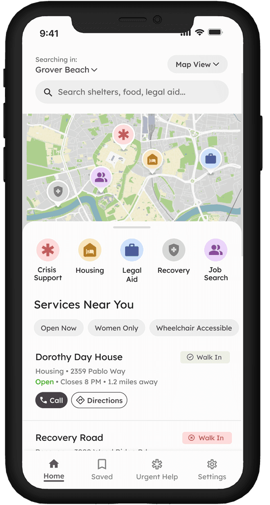
Browse by category: shelter, housing, legal aid, recovery, and job search. Filter by availability, walk-in status, and accessibility needs. Designed in mind for users in crisis who need answers fast, not another difficult site to navigate through.

Service Details and Directions

Users can view eligibility requirements, hours, and what to bring before leaving their place. Then, they can navigate directly to the service without switching apps. We built this because for users on limited data and no car, a wasted trip is a setback they can't afford.

Virtual AI Caseworker

Users can ask in plain language "I need emergency housing for a family of three" — and get personalized results without knowing exactly what to search for. We built this for users navigating crisis who shouldn't have to already understand the system to use it.

FRAMING THE PROBLEM

Residents had no single, trustworthy place to find help.

Through 13 stakeholder interviews and surveys with 50+ program participants, two patterns surfaced consistently. Users were spending time searching across 4+ fragmented, outdated sites just to find one relevant service, and when they arrived, critical information like eligibility requirements, walk-in hours, and what to bring was either buried or missing entirely.

Through 13 stakeholder interviews and surveys with 50+ program participants, two patterns surfaced consistently. Users were spending time searching across 4+ fragmented, outdated sites just to find one relevant service, and when they arrived, critical information like eligibility requirements, walk-in hours, and what to bring was either buried or missing entirely.

4+

Sites users search just to find one relevant service they need to succeed.

0

Unified places to check eligibility, hours, and walk-in status upfront

Many links look broken or are outdated. Who do I even trust?

Trust broke down the moment she started searching.

From crisis to scattered resources to dead ends, the system failed her at every turn.

USER RESEARCH

13 caseworkers. 50+ survey patterns. One consistent pattern.

Through 13 stakeholder interviews and surveys with 50+ program participants, two patterns surfaced consistently. Users were spending time searching across 4+ fragmented, outdated sites just to find one relevant service, and when they arrived, critical information like eligibility requirements, walk-in hours, and what to bring was either buried or missing entirely.

Through 13 stakeholder interviews and surveys with 50+ program participants, two patterns surfaced consistently. Users were spending time searching across 4+ fragmented, outdated sites just to find one relevant service, and when they arrived, critical information like eligibility requirements, walk-in hours, and what to bring was either buried or missing entirely.

48%

Reported a wasted trip due to missing or unclear eligibility information.

68%

Found the existing GSS site too confusing to navigate.

87%

Rely solely on mobile devices for internet access.

Meet Our User Persona, Cameron

Cameron, our user persona, is resourceful, mobile-only, and out of time.26-year-old gig worker navigating an eviction with 5GB of data and no clear place to start.

OUR GOAL

Design an inclusive, trustworthy mobile experience that helps vulnerable individuals quickly find the services that best meet their needs.

PRODUCT DIFFERENTIATION

PRODUCT DIFFERENTIATION

No existing tool was built for the people who needed it most.

211, FindHelp, and Homeless Youth Shelter Directory all serve a general audience or are too hard to navigate on mobile. OpenDoor sits in the only empty quadrant — easy to navigate, built specifically for vulnerable populations.

No other tool occupied this quadrant.

Easy to navigate, built exclusively for vulnerable populations, OpenDoor fills a gap the market left empty.

Knowing what not to build is equally important as knowing what to build

User accounts, ratings, and push notifications got cut — not because they weren't useful, but because they added friction for users who needed help in under a minute. We protected speed and simplicity above everything else.

BEFORE VERSUS AFTER

Building Toward What Users Actually Need

For more than 5,000 people in Santa Barbara County, finding housing and shelter resources is frustrating and time-consuming

Before

Services buried below a charity homepage with no clear entry point
Overwhelming list of categories with no filtering or hierarchy
No way to see service status, distance, or availability at a glance

After

Users can discover services through categories or browse "Services Near You"
Has secondary filters
Users can easily scan the name, status and primary actions

Before

Has a map/list view toggle (visual search vs. list search)
High cognitive load (i.e wall of controls/filters)
No primary action

After

Highly scannable cards
Builds users' trust with an entrance photo, confirming the location is safe to approach
Uses progressive disclosure by hiding secondary info

Before

Has detailed service description
Dense paragraph text is hard to scan quickly
No eligibility info, hours, or accessibility details visible

After

Separates search into its own view
Provides three distinct search paths (Keyword, Category, AI)
Positions AI as a conversational path to an answer

FINAL PROTOTYPE

A mobile-first app that meets residents where they are.

10 screens, 26+ components, built for Android and iOS, every decision optimized for low data, low time, and high stakes.

OUTCOME

We Won 6+ Awards, Partnered With 20+ Organizations

OpenDoor consolidates 350+ services into a single mobile app built for residents with limited data and time. The experience centers on three core flows: discovering nearby services, accessing clear eligibility details, and getting directions, all without an account or WiFi.

→ Backed by Amazon Web Services

→ Xfund's $100k pitch challenge Finalist (1 of 10)

92%

of usability testing participants would use OpenDoor if deployed

20+

Orgs approved pilot programs across the Bay Area and Boston
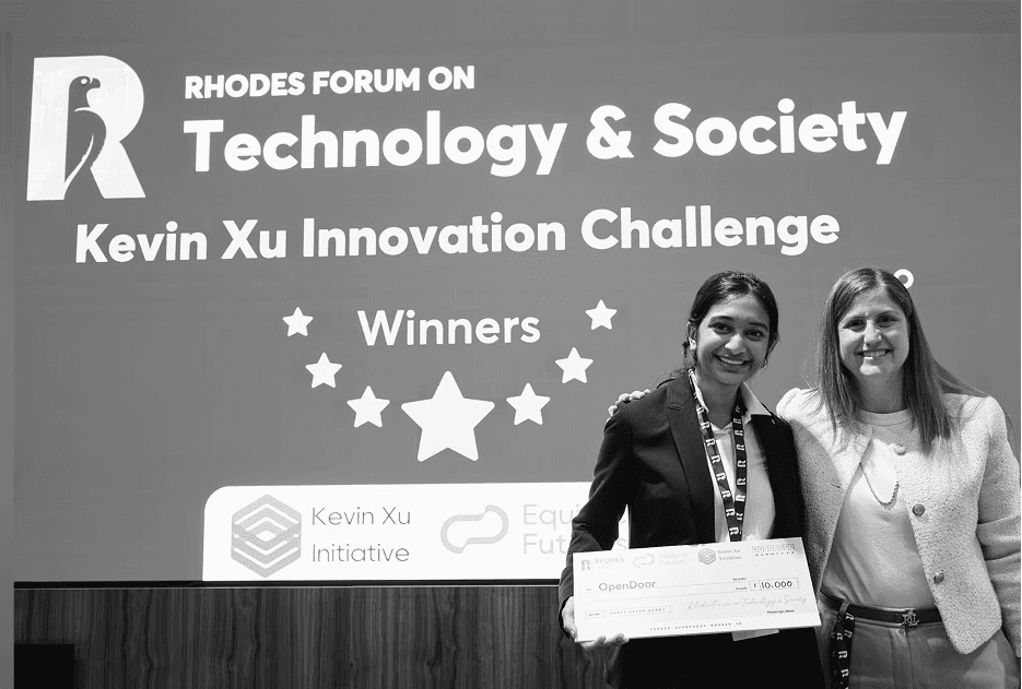
The moment OpenDoor won the Kevin Xu Innovation Challenge

Browse by categories such as housing, legal aid, shelter and accessibility needs such as wheelchairs.

REFLECTIONS

Key Takeaways As a Founding Designer

Navigating Ambiguity to Ship a Product Under Real Constraints

Navigating Ambiguity to Ship a Product Under Real Constraints

This project required designing without clear requirements, reliable infrastructure, or a single “primary” user. I learned how to distill a complex, high-stakes problem into a small set of decisive product bets, rapidly prototype against them, and align stakeholders around what to build first.

This project required designing without clear requirements, reliable infrastructure, or a single “primary” user. I learned how to distill a complex, high-stakes problem into a small set of decisive product bets, rapidly prototype against them, and align stakeholders around what to build first.

Rapidly Iterating from Zero to a Functional Product

Rapidly Iterating from Zero to a Functional Product

Starting from an outdated system with no mobile strategy, I learned how to move quickly from problem framing to mock prototypes, test assumptions early, and iterate toward a shippable end-to-end experience under tight constraints.

Starting from an outdated system with no mobile strategy, I learned how to move quickly from problem framing to mock prototypes, test assumptions early, and iterate toward a shippable end-to-end experience under tight constraints.

← Back

Overview

Problem

Solution

Outcome

Opportunity

Next Steps