Medocity

Medocity

Medocity

Thumbnail image

Overview

Overview

Overview

Medocity, a digital healthcare service helping individuals manage complex, long-term health conditions, challenged Berkeley Innovation to completely redesign their website with the goal of increasing their target visitor conversion rate above 10%.
Role
Role
Product Design Consultant
Role
Product Design Consultant
Role
Product Design Consultant
Timeline
12 Weeks
Timeline
12 Weeks
Timeline
12 Weeks
Team
4 Designers
1 Project Manager
Team
4 Designers
1 Project Manager
Team
4 Designers
1 Project Manager

Problem

Problem

Problem

How might we redesign Medocity to better engage healthcare stakeholders and increase the target-visitor conversion rate?

How might we redesign Medocity to better engage healthcare stakeholders and increase the target-visitor conversion rate?

How might we redesign Medocity to better engage healthcare stakeholders and increase the target-visitor conversion rate?

Impact
I conducted virtual usability testing after handing over our final designs, comparing the current version of the website with the redesigned version. The results revealed a 35% increase in key task completion rates.
Final Designs
Final Designs
Final Designs
Context

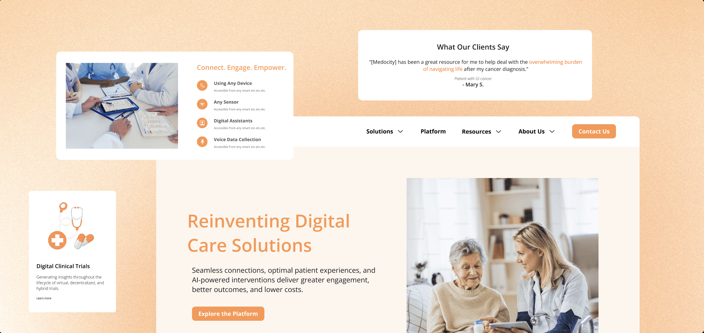
Medocity, a digital healthcare service based in New Jersey, had long struggled to improve its visitor conversion rate. Despite being a local leader in telehealth, the company faced persistent challenges in turning website visitors into long-term partners.

Our Solution
Before
Interviewees noted a lack of consistency across the page, with too many impact stats and a lack of visual and textual information hierarchy.
After
We prioritized key impact stats for users, revamped UX writing, and implemented hover cards to maximize content information while maintaining an engaging visual hierarchy.
Before
Interviewees noted that the descriptions of benefits are lengthy with no visually engaging images and that there's a lack of quantitative credibility.
After
We prioritized visually engaging prototypes of key clinical trial solutions, designed a foldable FAQ section, and placed multiple calls to action.
Before
Interviewees expressed a desire for better visibility of Medocity's partnerships and achievements, as well as clearer visuals that better explain the stages and steps of the clinical trial process.
After
We strategically organized information backed by our research, redesigned case studies, and included pathos-driven testimonials and awards and recognitions to strengthen Medocity's trust and identity.
User Research
Findings & Analysis
User Research
Findings & Analysis
User Research
Findings & Analysis
We began by conducting usability testing with 7 pharma-business stakeholders and analyzed ~30 survey responses to gain a deeper understanding of our users' pain points.
Lack of Credibility
A majority of the interviewees agreed that Medocity lacked trustworthiness, bringing to light the need for trust-building content like case studies and quantitative outcomes.
Lack of Credibility
A majority of the interviewees agreed that Medocity lacked trustworthiness, bringing to light the need for trust-building content like case studies and quantitative outcomes.
Lack of Credibility
A majority of the interviewees agreed that Medocity lacked trustworthiness, bringing to light the need for trust-building content like case studies and quantitative outcomes.
Lack of Visuals
Many respondents emphasized the need for more engaging visuals and authentic imagery that foster a more emotionally resonant user experience.
Lack of Visuals
Participants highlighted the need for engaging visuals, including interactive prototypes and authentic imagery, to create a more emotionally resonant user.
Lack of Visuals
Many respondents emphasized the need for more engaging visuals and authentic imagery that foster a more emotionally resonant user experience.
Lack of brand identity
A recurring comment noted was that Medocity lacks a strong, cohesive brand identity, meaning it requires a more consistent structure, layout throughout its webpages.
Lack of brand identity
A recurring comment noted was that Medocity lacks a strong, cohesive brand identity, meaning it requires a more consistent structure, layout throughout its webpages.
Lack of brand identity
A recurring comment noted was that Medocity lacks a strong, cohesive brand identity, meaning it requires a more consistent structure, layout throughout its webpages.
Key Testimonial

'[I think] One of the biggest obstacles that is preventing users from contacting Medocity is the lack of intentional storytelling supporting the company’s credibility and competitive appeal, leading to disconnection between visitors and the company.'

User Persona
Journey Mapping Partner Evaluation
We decided to visualize our persona’s key touchpoints and map out the various actions he takes throughout his journey to gain a better understanding of his needs, emotional shifts, and behaviors at each stage. By doing so, we tried to uncover key insights into what motivates his decisions.
Competitive Audit:
What Worked Well
We conducted a competitive audit of 8 companies, including Bioformis, HUMA, Medable, Medisafe, Obviohealth, Adheretech, and Science37, to better understand what worked in their user experiences.
Key Solution Differentiators
Highlights the company's specific advantages in providing medical solutions and services, by highlighting patient outcomes and innovative care models.
Interactive Mockups
Interactive mockups helped effectively showcase features that promote medical adherence, such as clinical trial tracking, medication reminders, and interactive care plans.
Case Studies & Testimonials
Case studies and testimonials effectively provide social proof that their product and/or service works wells. They illustrated succinctly the success and impact of their company.
Concise UX Writing
Concise UX writing helped us scan content and easily find key call-to-actions, increasing the likelihood of converting potential visitors to actual partners.
Competitive Audit:
What Didn't Work
By putting ourselves in the shoes of potential users, we conducted affinity mappings to identify the specific design elements across these websites that failed to deliver a good user experience.
Repetitive Statistics
Repeating the same statistics can make visitors feel like they aren't learning anything new, leading to frustration and high bounce rates.
Incessant Scrolling
Visitors might not even reach critical sections of the site, such as a call-to-action or key product offerings, because they can't find the bottom of the page, feeling lost.
Unintuitive Navigation
A confusing menu and/or a lack of clear categories can cause visitors to abandon the site, even if the information is valuable, especially when they are seeking fast and easy-to-understand information.
Inconsistent Structure
An inconsistent structure (in terms of layout, fonts, colors, or content presentation) can confuse users, which may make them trust the brand less.
Design Goal

By strategically improving the information hierarchy and refining Medocity's visual identity, we aim to create a website that better serves the needs of stakeholders and positions Medocity as a reliable and valuable partner.

Redesigning the
Provider's Page
The Providers page of a digital healthcare website serves as a central hub for visitors/potential partners to access critical clinical tools, resources, and information about digital clinical trials.
Iteration 1
Users noted that the page length felt excessive, and the value proposition seemed overly direct, lacking professionalism.
Final
The card layout makes value proposition easily scannable while the impact-driven calculator strengthens credibility.
Decluttering the Experience
Our UX writing, branding, and layout for the 'Data Integration of Clinical Trials' section simplifies complex information, with collapsible FAQ sections that keeps non-essential details accessible.
Redesigning the
Platform Page
The Platform Page highlights key value propositions and benefits, including the details behind their streamlined patient care, quantitative metrics, enhanced workflows, and real-time data integration.
Iteration 1
A confusing visualization that attempts to empower stakeholders, following a lengthy explanation of the stages of a clinical trial.
Final
Clear explanation of drug marketing potential for stakeholders, followed by embedded prototypes explaining the clinical trial.
Featuring Engaging Value Propositions
To address Medocity's lack of visual appeal and clear value proposition, we used engaging images and incorporated their bright orange branding throughout the website.
Redesigning the
Homepage
The homepage features key testimonials, partnerships, accreditations, case studies, and national recognitions. It serves to highlight the platform’s credibility and the support available to potential partners.
Iteration 1
The 'Trusted By' section lacks images, and the testimonials don’t effectively convey credibility.
Final
Highlights why stakeholders should choose Medocity at the top for immediate visibility after an effective testimonial section.
Establishing a Cohesive Brand Identity
We curated 3 hover-on cards that clearly describe different sections of the website visitors can explore, followed by an explanation of how Medocity empowers its patients.
Brand Identity
& Design System
Brand Identity
& Design System
Brand Identity
& Design System
We created a cohesive brand identity that reflects Medocity’s mission to innovate (thus, the orange) and simplify healthcare by aligning the brand identity with their core values—trust, care, and innovation.
Revisiting Final Designs
Key Takeaways
& Conclusion
After Handoff
I observed a 35% increase in their ability to complete the same key tasks that were presented to our usability testers before the redesign through a guided user testing session that took place virtually.
If I Had More Time
I would spend more time focusing on feature prioritization, as well as creating a more unified, in-depth design system, visual guide, and information hierarchy to ensure a smoother handoff.

Designed by

Priya Venkatesan

Designed by

Priya Venkatesan

Designed by

Priya Venkatesan