Home / Berkeleytime
As design lead, I built a 45 component WCAG-AA library that gave design and engineering a shared language, reducing duplicated work and bringing visual unity back to a platform 50,000+ students rely on daily.

Team
2 Engineer
3 Designers
1 Design Lead
Skills
User Research
Frontend Development
Design Systems
Tools
Figma
Storybook
VS Code
Claude Code
My Contribution
Part 1: Foundations (Co-created library & visual primitives with 3 designers)
Part 2: Systems Lead (Sole owner for Act II; audited 3 codebases, fixed token scales, & built Storybook DX)
At a Glance
A design-to-dev workflow that automates handoff and standardizes implementation.
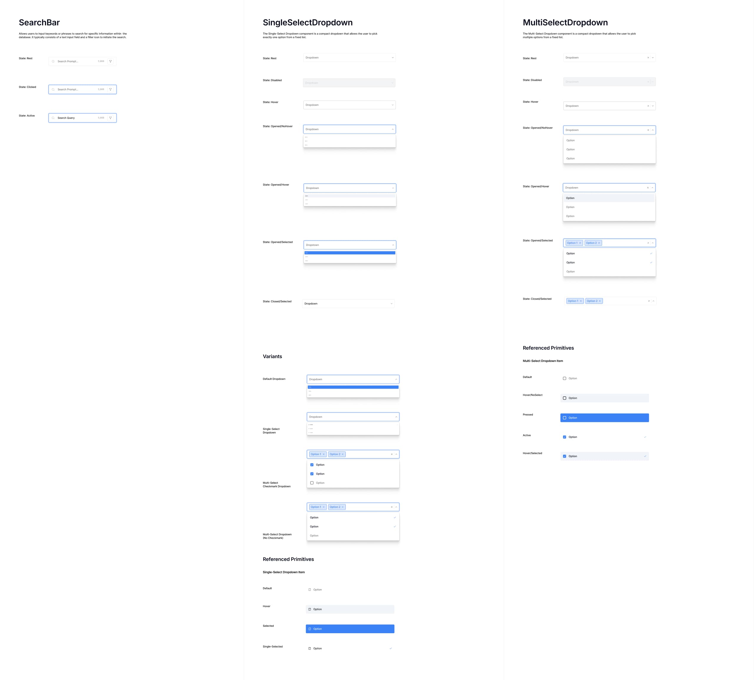
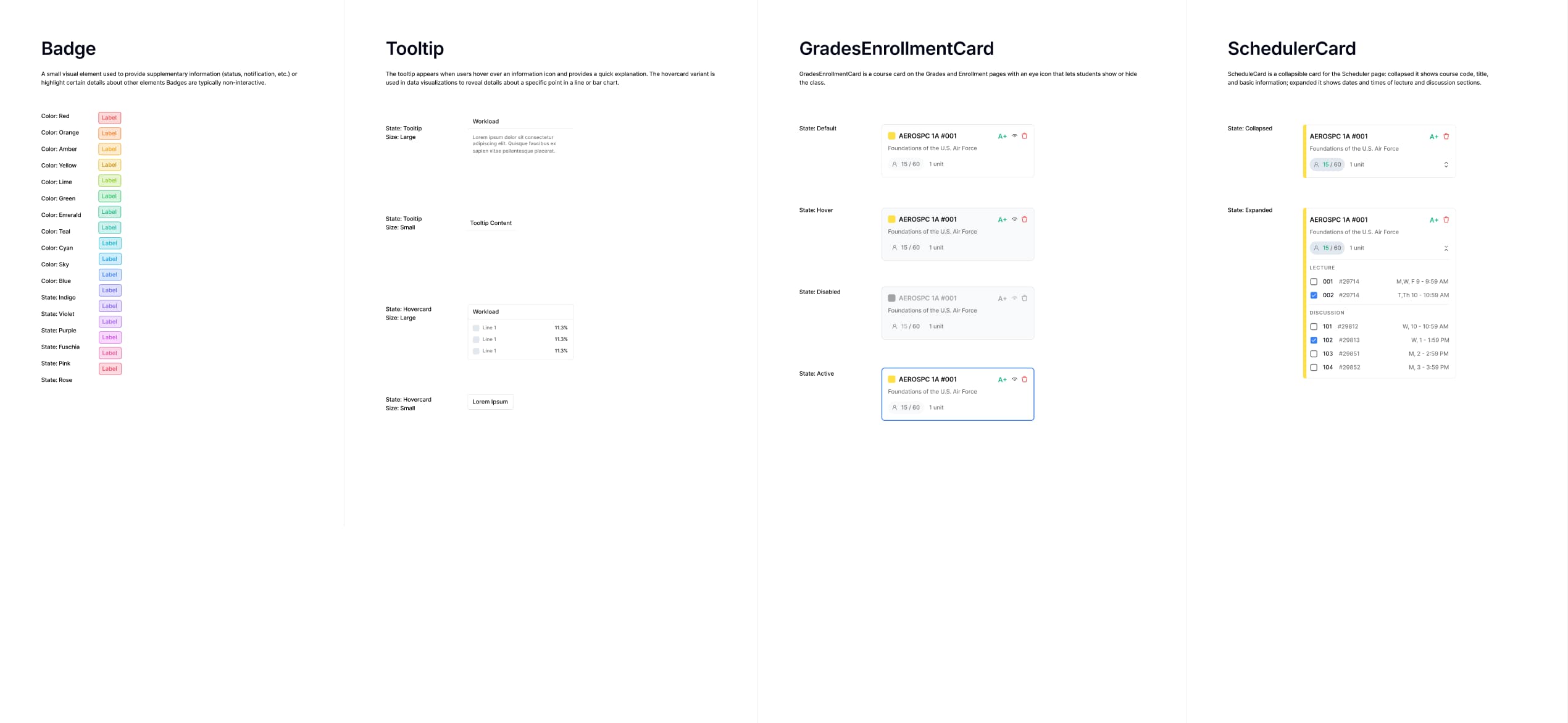
My team built a 48+ component WCAG-AA library in Figma and implemented interactive states in Storybook, creating a single source of truth for design and code. The system spans core primitives, complex inputs, and data visualization, eliminating the design-to-code drift that had fragmented the product across every new feature shipped.
48+ Components
built on Radix UI themes, establishing a 1:1 token structure between Figma and React
1157+ Hardcoded Values
… to none across padding, gap, border-radius, and shadow

Before: an inconsistent grades page built without a shared design language
Inconsistent component rendering, a broken A+ bar, mismatched card styles, and an oversized tooltip, each a symptom of lack of communication between engineers and designers building without a single source of truth.
After: rebuilt grades page using the Berkeleytime design system
Unified data visualization components, consistent card hierarchy, and a cohesive interaction language across different states (active and inactive), shipped using our component library and validated in Storybook.
Solution
Component library highlights
100%
Of the engineering team references component library before pushing prod
2 rounds
Design-to-dev handoff reduced from multiple review cycles to two


Problem
The Problem: Structural Code Drift & Fractured User Trust
Figma Copy-Paste Drift
One component, three different styles. Without shared production tokens, the Course Card was implemented differently across pages, resulting in variations in typography, color, and spacing.

Manual & High-Friction Handoffs
With no copyable component primitives in Storybook, developers were forced to rebuild components from scratch, turning handoff reviews into multi-week iteration cycles.
Designers used static values in Figma like #003262 and 17.5px with no linked token
→
Without root variables defined in production, Dev Mode auto-generates raw fallback values developers copy-paste directly.
→
Developers inspected pixel values line by line and hand-coded CSS, duplicating work each time.
→
Handoff reviews bloated into multi-week iteration cycles fixing visual drift and accessibility bugs.
User Research
A pattern of inconsistent feature updates had fractured user trust over time.

I was also wondering if different parts of berkeleytime are being built by different people? it's a bit inconsistent. — r/berkeley user

I was also wondering if different parts of berkeleytime are being built by different people? it's a bit inconsistent. — r/berkeley user
We audited existing UI to identify the highest-impact, most inconsistent components first.
We audited Berkeleytime’s core pages to identify the most frequently used and inconsistent UI components. High-traffic elements like search bars, dropdowns, and course cards were prioritized first since they appeared across major user flows. We then established design foundations before designing more complex Berkeleytime-specific components.


We then created a strategic Prioritization & Standardization Matrix
From Audit Insights to Execution Roadmap We mapped every audited component against a Frequency vs. Complexity matrix—annotating visual discrepancies directly on the board to convert raw audit findings into a prioritized, actionable design checklist

Lastly, Building the Unified System & Token Primitives
Step 1: Establishing Token Foundations (The Engine)
Built a math-based token system—implementing a Radix-derived 9-step spatial scale (4px to 64px) and matching :root SCSS variables to replace hardcoded CSS guesses in code.
Solution
Component library highlights
100%
Of the engineering team references component library before pushing prod
2 rounds
Design-to-dev handoff reduced from multiple review cycles to two


Outcome
From fragmented UI to a comprehensive system applied across every new feature shipped.
The design system became the foundation for all new Berkeleytime development. Engineers referenced Storybook components directly, reducing the copy-paste drift that had accumulated across the codebase. The grades and enrollment pages, Berkeleytime's two highest-traffic views, were rebuilt using the library, restoring the visual consistency that 50,000+ students depend on each semester.
48+
components are a part of our library
20+
comments appreciating updated UI through usability testing

Presenting our work at the end-of-year ASUC Tech Showcase :D
Rections
Design systems work taught me the importance of balancing communication with craft.
STILL CURIOUS? CHECK OUT MY OTHER CASE STUDIES

EY Studio+
HANDED OFF 2026
Berkeley IT Department